YouTube thumbnails have always been part of your YouTube channel—the small clickable images that a viewer clicks on to look at videos.
YouTube thumbnails are a major piece of your channel
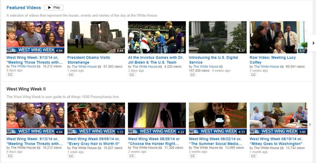
You can use thumbnails in a variety of sizes on your YouTube channel, but virtually all front pages uses a row of thumbnails at the bottom, such as these from the White House’s YouTube channel.
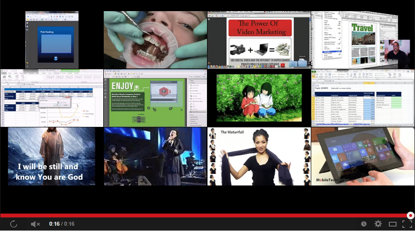
Thumbnails also show up when you get to the end of a video, depending on your settings—typically 12 thumbnails show on the video screen, enticing viewers to watch more videos.
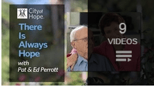
In a new wrinkle, the appearance of YouTube thumbnails in the listing of a playlist has changed recently—the number of videos in the playlist obscures the right side of the thumbnail. Playlists are a terrific tool (for more about them read this post). Thus, it’s definitely worth it to include them on your page and to consider the design of your thumbnails (more of the image on the left!) going forward.
YouTube thumbnails just got a boost
YouTube’s standard is to automatically select a thumbnail for you from your video, while providing a choice of three automatically generated images for your thumbnail, including the selected one. These come from your video, and sometimes they may be exactly what you need. However they can also be blurry because they’re taken from a video, or not just what you want.

That’s why it’s exciting that if your YouTube channel is verified (this post gives simple instructions for verifying) you can upload a custom thumbnail and gain the benefits of this extra level of control over your branding and video marketing. If you’ve gone through this verification process, go into video manager, and select “Add custom thumbnail,” and you’ll be able to browse to select an image.
Ten tips to make your custom YouTube thumbnail look great

- Take still photographs at your video shoot to use so that you will have options that will be contiguous with the video, or export a still photo from your video timeline during the editing process.
- Recognize that a standard still camera takes a taller horizontal image than the thumbnails accommodate. Compose your shot with this understanding.
- Follow YouTube’s guidance for size and format. That is: resolution of 1280 x 720 (with minimum width of 640 pixels), use a .JPG, .GIF, .BMP, or .PNG, remain under the 2MB limit, and use a 16:9 aspect ratio as it’s the most used in YouTube players and previews.
- Have a person in your photograph. People are naturally drawn to people.
- Use an image with a close up of a face making eye contact with the viewer.
- For the first video in a playlist, create an image that can accommodate the playlist thumbnail format. A textual element, as shown at the left, can achieve this.
- Use an image that reinforces your videos’ title and the actual content. An image of your spokesperson is a natural. Above, Nancy Jo Flint’s expression reinforces the pleasure she takes in giving to City of Hope.
- Make sure thumbnails look great at both small and large sizes. Too many elements make a small thumbnail into a smudge.
- Use bright images. The first image in the White House’s group thumbnails draws the eye with bright, even neon colors. High contrast draws the eye, too.
- Use a branding element. The City of Hope logo in their thumbnails reinforces the message that these are their videos.
YouTube thumbnails are basically analogous to the cover of a book; it may be better not to judge a video by its thumbnail, but it’s inevitably going to affect traffic. You want your thumbnails to be clickable, and YouTube just made that possible for anyone who takes advantage.

