One of our more popular posts is about YouTube Channel Art, so we’ve updated it for 2021.
YouTube Channel Art, also known as the banner or banner art, is a key place to make a first impression and help viewers see what your channel is about. Does yours need an update?
When to consider updating your YouTube Channel Art

It’s important to review your YouTube Channel Art periodically.
- Have your style guide, logo, color palette and/or fonts been updated?
- Are there new images or initiatives on your website home page that could be used to freshen your YouTube Channel Art and get your latest message across?
- If your channel art includes text, has more recent copy been developed?
If you answered yes to any of these questions, now’s a good time to update your YouTube Channel Art (and other social media channels, too).
As an example, the American Pharmacists Association (APhA) recently updated its branding, so it was the perfect time to update its YouTube Channel Art banner.
Once you decide to update, there are a few challenges involved in making your image look great.
YouTube Channel Art banner requirements
Use the correct image dimensions and size. According to the YouTube Channel Branding Recommendations, the minimum size for your YouTube Channel Art banner image is 2048 pixels wide x 1152 pixels tall, with an aspect ratio of 16:9 and maximum file size of 6MB. The reason why you want a large image is so it will look great no matter what device your viewer is using. Condensing a big file works great–the image will look sharp and crisp on both large and small screens. However, enlarging a small file will result in your image looking pixelated or washed out when viewed on large screens.
Making your YouTube Channel Art look terrific on all devices
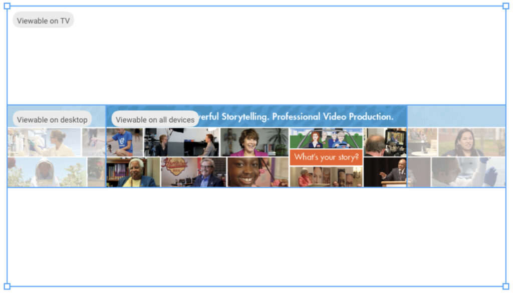
Check how the banner looks on different devices. You can only upload one banner image. While viewers can see the full image on large screens, the left and right edges will be cropped off on small screens, such as mobile phones. A good approach is to keep your most important image and text content within the image’s “safe area,” which is smack in the middle and measures 1235 pixels wide x 338 pixels tall.
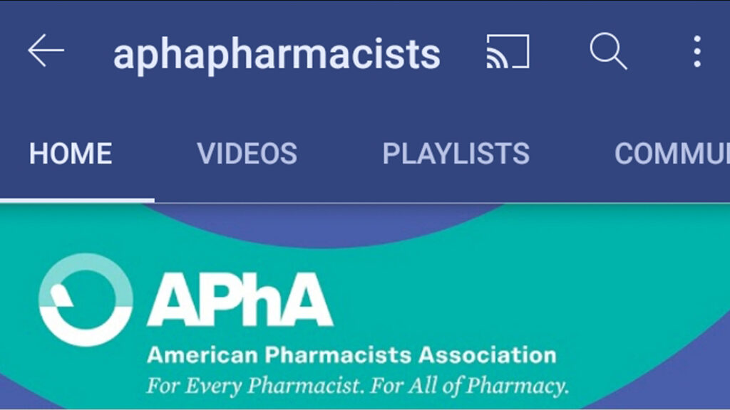
The APhA YouTube Channel Art image at the top of this post is a desktop size version, while the image here shows the same banner when cropped by YouTube for mobile device format.
Here are some tips to get the crisp, attractive image you want for your YouTube Channel Art:
- If you have banner artwork already done, check how it will or could look on different devices using the customization feature provided by YouTube in the customization area (YouTube Studio>Your Channel>Customization>Branding>Banner Image). You can upload your draft art file and mouse over the various views to see how the banner will appear on desktop, mobile devices and TV. Importantly, you can resize and move the blue box to adjust the portion of the graphic that is shown on the various devices. In the case of the banner here, it would be best to shrink the blue rectangle to have more of the graphic appear in the TV view. In this way, even with the same graphic, you can achieve a number of different looks and find one that looks best across devices.
- If you don’t yet have a banner art file, you’ll want to design it so that it shows well on all devices. As can be seen from the example above, you can design from the start to retain critical information such as text within the “safe area.” Unlike in this example, but in the case of the APhA banner, you can also see that it’s best not to design with photos close to the edges and instead have graphical elements at the edges that will look good and complete on screens of all sizes. The APhA banner shows how outer edges that are comprised of graphics or patterns can be quite forgiving.
- If you don’t have, or don’t want to create your own YouTube banner design, you can use an online YouTube banner maker, which can save you time. Canva, for example, has a large number of templates to choose from that will make your design process easier and address some of the key design issues above.
- You can also use a downloadable YouTube banner Photoshop template; there are many available online (some need to be paid for) and can be searched out using Google. A good practice is to start by setting the size of your image and guidelines based on the dimensions in the YouTube customization feature above, and build the image from the middle out.
Need help with your YouTube Channel?
By keeping the imagery, copy, and design of your YouTube Channel art consistent with your current brand as well as strong from a design perspective, viewers will easily recognize your organization on YouTube as well as when they move from your YouTube channel to your website, social media or other communications.
Although your banner is critical, other features, such as your channel trailer video, can also bring your personal message to your audience. Creating useful playlists and making sure your videos have relevant titles, descriptions, and keywords are other excellent ways to help viewers find your videos.
If you need help with video, request an estimate. We serve associations, foundations, nonprofits, and businesses in Washington, DC, Maryland, northern Virginia, and throughout the U.S.

