False.
Powerpoint is, without a doubt, the industry standard for presentations. It’s a proven standard and most of your organization’s audiences have seen enough Powerpoints to know what to expect. There are any number of resources that will tell you how to make a better Powerpoint presentation. They’ll give you word limits, image guidelines, and formatting tips. But in the end, a Powerpoint presentation is just a Powerpoint presentation. No matter how well-executed, they’ve seen it all before. Sometimes that works: the audience can concentrate on the message, not the medium. But sometimes a presentation needs spicing up. That’s where Prezi comes in.
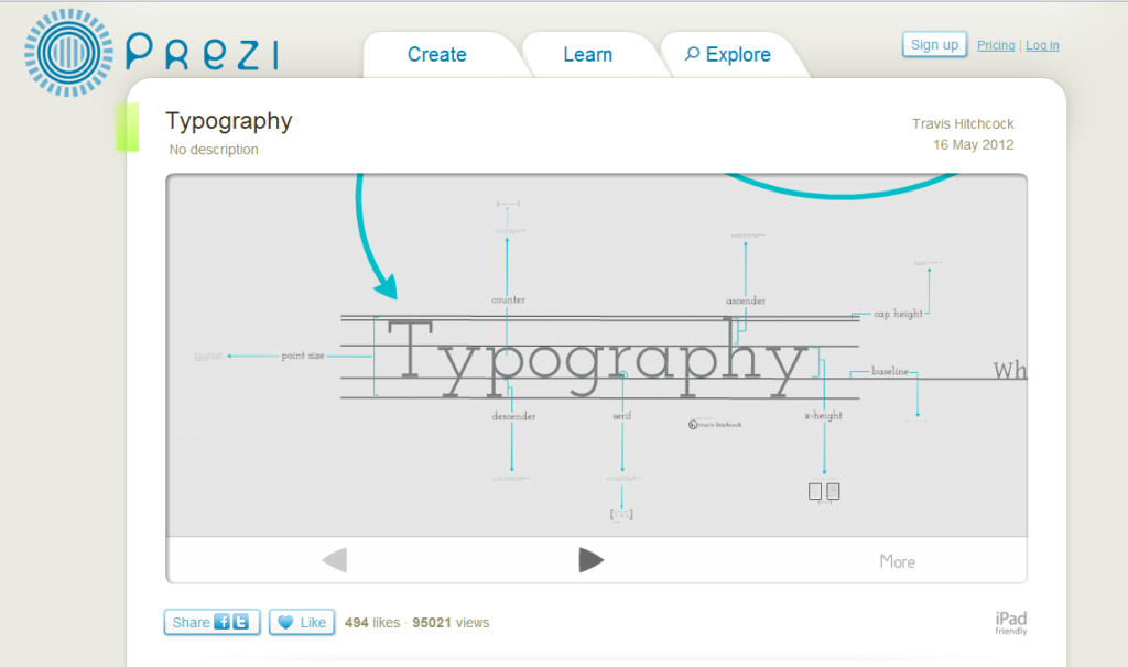
Prezi allows the user to move through screens in a presentation by zooming in and out on places of interest. Words don’t do it justice but this presentation on Typography shows that a fairly boring subject can look interesting with the right tool:

Prezi presentations are far closer to video than Powerpoint presentations, and are simply much more engaging to watch. They’re also far more interactive, in that the presenter can click and zoom out of sequence and adjust on the fly to audience needs or questions.
Powerpoint is essentially a slideshow, but a good Prezi looks like an interactive video. A Prezi comes off as higher tech, and amidst a group of Powerpoint presentations, it definitely stands out.
However, the program isn’t without drawbacks. As with any program, it takes time to learn, and just as there are some Powerpoints that should have never seen the light of day, there are also some atrocious Prezis. The biggest challenge with Prezi is simply learning to use it.
The next challenge is learning to use it effectively. Spinning around and zooming in different places can be distracting if each frame isn’t held long enough for the viewer to focus.
But once mastered, there is no question that Prezis, like video, are far more visually interesting than static images and far more likely to be remembered by your audience.
On Tuesday, in part 2 of our series on Prezi, we’ll offer some tips on what makes a good Prezi presentation. That post will also be part 3 of our series on tools that exemplify how trends in communication tools show the overall value of visually dynamic communication. If you missed the first, it was about Trapit.
If MiniMatters can help you improve the visual dynamism of your online marketing, or otherwise serve your video needs, we’d love to talk with you at 301-339-0339 or via email at videos@minimatters.com.


