Website storytelling begins “above the fold”
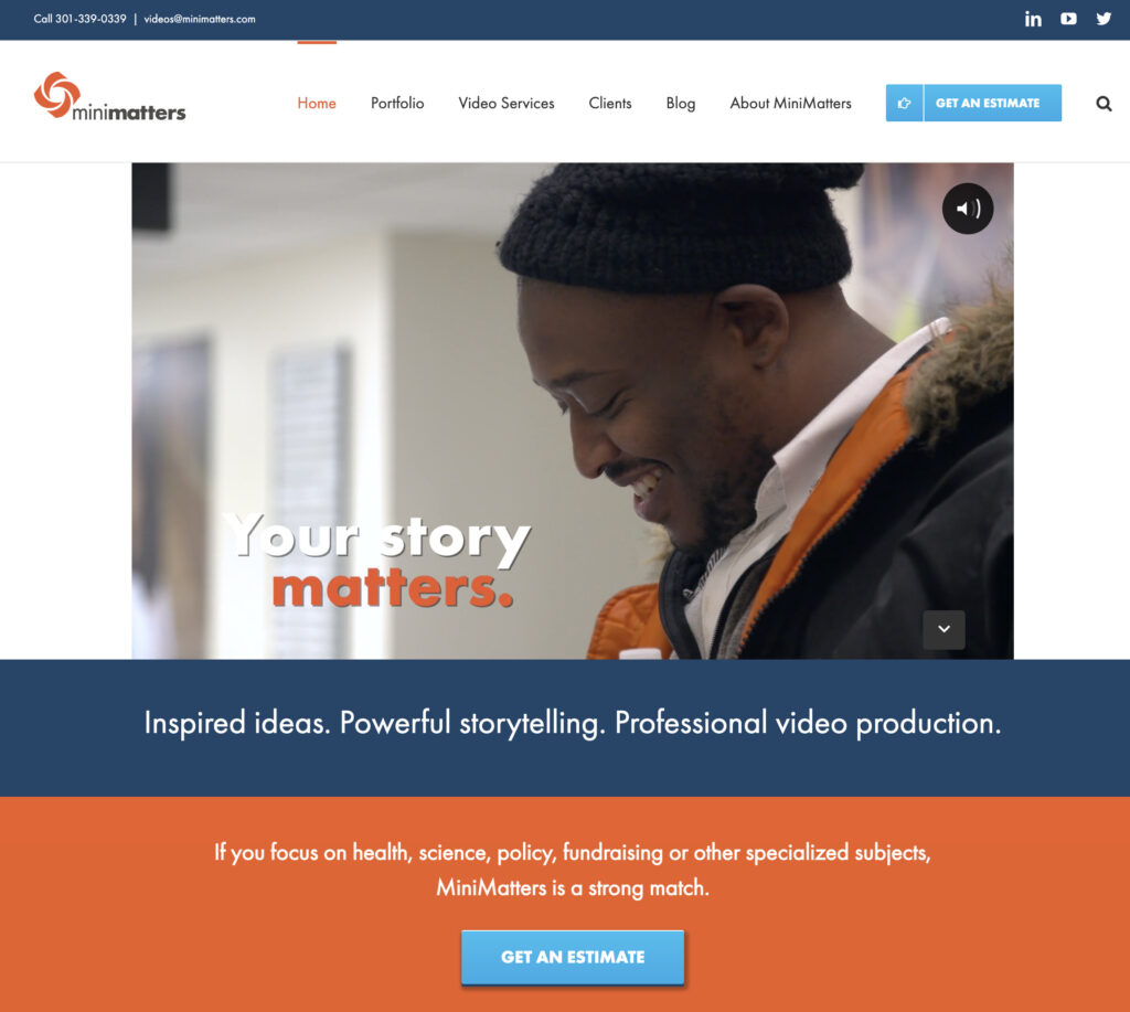
The area of a website that is visible without scrolling down is considered to be “above the fold.” The phrase comes from the days of printed newspapers where passersby would see only the top of a folded paper. Having good content “above the fold” is a core component of an effective website today.
And why is that? Hubspot’s marketing blog sums up the answer thusly (emphasis added): “If you were a new viewer, would you stay on your site at first glance?”
As associations, universities, nonprofits, or businesses, we need people to spend time on our sites in order to build relationships. An important technique to kick things off and create the opportunity for relationships to develop is to include a bold visual element like a video “above the fold.”
Showing a video near the top of your webpage grabs attention and may capture enough interest for your visitors to want to “go deeper.” Or, if people are comparing the websites of different organizations or businesses, yours may be the one they choose to explore further. Your content “above the fold” can be decisive in whether visitors allow themselves to become immersed in the story you have to tell.
A story structure engages your audience
People feel comfortable with experiences that have a beginning, a middle, and an end–the standard elements of a story. A strong website design model takes advantage of this familiar structure with a pathway that includes garnering interest above the fold (beginning), offering opportunities for exploration (middle), and promoting action (end).
Grab interest “above the fold” – the website storytelling beginning
Grabbing interest “above the fold” is the most important aspect of the story you tell through your website design and content. It’s a simple fact that your website “story” will fail to launch if people leave your website in the first few seconds. Yet it’s one that some people fail to consider as they get into planning out all the detailed content of the site. A best practice is to intrigue your viewers, hinting that they are at the beginning of a story that will unfold.
In addition, there are quite a number of people who lack the time or attention to explore your site or others in detail. With these people, as long as you meet the initial interest and relevance criteria, you may find that viewers head directly to the action. Here, too, a captivating first impression makes a big difference.
Give more information – the website storytelling middle
For those viewers who do want to explore your content further, you can employ multiple methods. One is to include links to other internal pages that viewers can click to. Easy access to related products or blog posts, or access to reviews often serves this function.
Provide a call to action – the website storytelling end
Make sure your key call to action — like providing the chance for your viewers to call, donate, advocate, register, or buy — flows from you story. And make sure that any call-to-action button is clearly visible on your page.
If your website has compelling above-the-fold content such as a video, people are much more likely to follow the story to an ending in your call to action.
For videos that tell a story and that can give that important first impression, MiniMatters can help. Call us to discuss your needs or complete our online estimate form as a first step. We’ll get right back to you.

